
Work in Progress: Derby
Every now and then, we gather together and think, “Right. What do we do next?“

Our design planning sessions normally involve the following: copius amounts of coffee, back issues of fashion and interior magazines and a big box folder full of Yukari’s old design work (One day, I’ll have to show you a little look at some of our design archive- it’s a riot to look back at some of the things we’ve done). We also make sure we have a variety of different mediums to work with- as some of you may know, there’s a real difference not only in how the design looks, but also how the colours and textures come through, when it comes to what kind of surface we are designing on.

“What’s the story?”
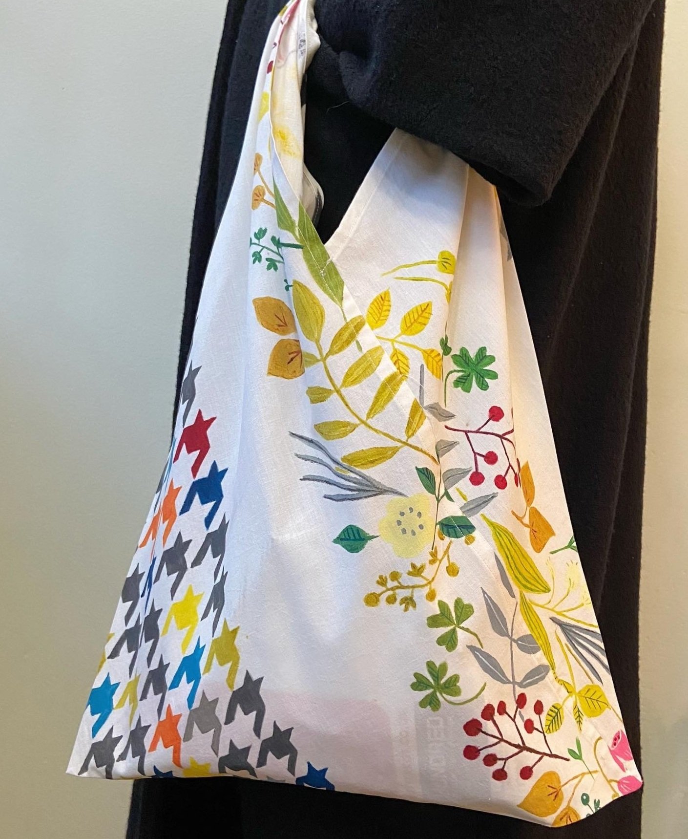
Derby has its roots (pardon the pun) deeply embedded in the houndstooth fashion print. A centuries old design, we were drawn to it for its range of scales, styles and textures that it could be applied to.
Yukari begins every design by sketching, hand painting and cutting out various elements that will appear within a design. Oftentimes I would come back from a meeting or errand and find her immersed in a hand painted tryptic of Derby, spanning from an A4 piece of paper to a metre long piece of fabric. This is where it gets really interesting- nearly every ‘tooth’ on Derby has been hand painted by Yukari. It was a real trial and error process- some colours didn’t work well next to the other, some scales were too distracting, some too naîve. It’s all about balance!
“What will this work on?”
Whilst we mainly had wallpaper in mind, we also wanted to design something that would work well on fabrics as well as on accessories and products, too. Yukari mentioned that she really wanted to do a design that worked well on clothing, too; something that would add not just a pop of colour to a wall, but a design that could easily be co-ordinated into the rest of the home. Having a variety of colours that didn’t clash with the rest of the interior whilst drawing together all the various elements of an individual’s room and their personality was essential- the same prinicpal can be applied with clothing choices. After all, sometimes more is more!
Size and scale is also very important. What may work on a cushion, may not work as well on a wall. And, what works on a cushion, may not work as well on a shirt. I think Yukari and myself agree on one thing: we are both very visual learners and prefer tactile testing rather than digitally judging things like scale and colour. We tested the scale of Derby manually by printing out copies of the design, taping the A4 papers together and then hanging it on our studio wall. A step back, a few variants next to one another, even working with it in our peripheral vision to see how it sits over time, helped us to develop Derby into something that would be able to be used comfortably, despite its initial intricate appearance.

“Why ‘Derby’?“
You may be wondering how and why we name our wallpaper and designs- with colourways called ‘Gimlet’, ‘Pacific’ and ‘Macaron’ or designs named ‘Hipster’s Paradise‘, ‘Lord of the Manor‘ and ‘Shipping Forecast‘, we certainly couldn’t have made things more mysterious!
Well, at the end of the day, we want all of our designs to tell a story. Once a design is sorted, we have three main and immediate objectives: What kind of feeling we want it to evocate, what to call it, and what the colour variants should be reminiscent of.
It’s my job to listen to Yukari’s inspiration and apply it to my own knowledge of literature, art and our combined experiences living in both the United Kingdom and Japan- our interests, hobbies and personal passions all come to the forefront when it comes to naming a design. So, it becomes time for me to pull out my notebook and get to work linking what kind of feeling I think the design needs to portray. Sometimes it involves childrens books, sometimes it involves poems, and other times it can involve reminiscing over walks in the park. This time around, it’s off to the races!

Palomino
Palominos are a gorgeous sort of tawny, creamy gold, often with a striking white tail and splashy markings, and can be real showstoppers when you see them! On top of that, it brought me back to my childhood clambering on the back of the little tan and beige shetland ponies and blasting through a gymkhana (think sports day but on horseback), coming out of an egg and spoon race or a mounted apple bobbing contest triumphantly clutching several rosettes, and the joyful feeling of displaying them all over my walls when I got home! So now you can see where the name comes from- a colourway that evokes joy and energy whilst also having its feet firmly in tradition.

Dapple Grey
Dapple Grey horses evoke a slightly more orderly image than the sweet (often muddy) little ponies that of my youth! These horses are mottled with a myriad of grey and black dapples over pale silver coats, and make me think of the iconic horses I would see being ridden by famous riders whilst flipping through my treasured copies of Horse & Hound and the cut outs of daring photo finishes whenever they were featured on the front pages of my parents’ newspapers. And so, our elegant but charisma-laden monotone colourway was born!
So, there you have it! From inspiration, to initial drafts, to variations and the cutting room floor, to childhood and back again, resulting in this design gracing clothing, handpainted cushions, tote bags and wallpapers. That’s Derby for you- a real marathon of a design.
I hope you enjoyed this look into what goes behind our design process. If you’re interested in Derby for your home, pop on over to our featured design page- we’ve gathered everything into one place where you can take a look at the range for yourself!